
Website design survey for insuremekevin
I am the first to admit that when it comes to designing my website I’m walking through a dark room with a blind fold over my eyes. Because I have gotten various critiques, both positive and negative, from professional website designers and visitors, I decided I would do a little crowd sourcing with designing my website.
Old clunky WordPress theme
When my website got hacked with malware, directing viewers to a site for generic Viagra of all things, I figured it was time to update the WordPress theme and rework the design. I liked my old design but the “free” theme wasn’t being support by the developer anymore and it was starting to get really cluttered with goofy sidebar pictures, links and announcements. Even though the old website was getting kind of clunky, I felt it still represented my personality with the layout and colors I had chosen.
No corporate looking website
As I searched for a new design theme I found most of them to be very formulaic and corporate looking with very few options for personalization. I finally found a WordPress theme call Dynamik from CobaltApps that works with the Genesis framework. Dynamik is one step below writing a website from scratch with HTML code. The Dynamik theme lets you control numerous aspects of the design from the width and color of borders, type font and sizing to a multitude of different layouts.
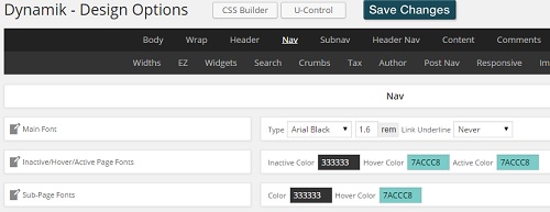
Dynamik, a Genesis child theme, offers lots of options for customizing a website without knowing HTML code.
Constantly tinkering with design
Dynamik is definitely for a person who really likes to tinker with the design of their website. It can be overwhelming and I’ve spent too much time learning about the functionality of Wordpress website stuff like hook boxes and conditionals. As of the beginning of October, I’m relatively pleased with the site but I do continue make changes and little adjustments.
What’s the website’s goal?
But just because I like my website that doesn’t mean it resonates with the visitor. Some website professionals have said the site is still too busy and “colorful”. That it detracts from the user’s experience. The main purpose of my website is to deliver information and introduce me as a health insurance agent. Since me website and my approach are a little unconventional, I decided to put a survey on my website asking for viewers input into the website’s design.
Crowd sourcing my website design
I suppose I’m trying to crowd source my website design. I would rather have visitors tell me how I should design my website to make it easy for them than have my design be some sort of branding and marketing statement. I mean, my website will always be influenced by my personality to some degree, but if people find some element of my design to distracting, I need to lose. But I’ll never know unless I ask.
Tell me what you really think!
I have no idea if anyone will fill out the survey or if I will get any meaningful results. If I do I will report them here. But in an online world where we constantly have to accept what professionals think is best for us in the design of Facebook, a confusing government websites or an enrollment website like Covered California, I hope some folks will appreciate that I’ve solicited their input to design a better website, even if they don’t take the survey.
Uhh…as long as you are here and have found me, if you would like, you can scroll down the left sidebar and on the bottom with be a survey from Survey Monkey that is anonymous.
October Update
After running the survey on my website for over two weeks and having over 9,500 visitors during that time, I tallied less than one percent of my visitors taking the website design survey. Overall there were no negative comments and most people indicated the site was easy to navigate and my design and colors were not distracting. One survey respondent comment that he thought the site should look more professional. What was more important than responses to the design were the answers that people wanted more content on health plans, hospitals and Covered California. It seems like content trumps design as long as the layout isn’t totally confusing. Consequently, I will be focusing more of my content on those topics the survey respondents indicated they want to read about.
Thank you to all who participated. It will help me produce a website that focuses on providing content my readers indicated they wanted to see. And, I like the colors and layout and will keep it with a little tweaking here and there to keep it fresh and seasonal.
