
Some of the most uninspiring logos can be found in the insurance industry. When I first got into the insurance field as an independent agent I decided to play it safe and not attempt to create a logo. But as my website has become more popular, and I recently published a book, I found myself considering images that reflect me and what I represent. The result is probably a logo-failure by professional standards, but one I really enjoy looking at. It is a stylized concrete arch bridge over a body of water.
I look at the logo one hundred times a day
I did not set out to create a logo that would immediately be recognizable for the insurance services I represent. I am a visual person. I appreciate good graphic design, clean architectural lines, and the proper use of color. Above all, my eye is drawn to shapes and designs that I enjoy viewing over, and over, and over. Consequently, any logo I was to develop had to be an image I liked looking at on my website, business cards or other printed material I send out.

InsureMeKevin logo is a stylized concrete arch bridge over a body of water.
InsureMeKevin logo is just a bridge
If I was a talented graphic artist, I would have designed a logo that had a strong mid-century modern influence. That was my original inspiration for the block and line design for my initial branding used on my website and letter head. As it is, I am not a talented graphic artist, architect, or designer. So I put the whole concept of developing a logo aside for years.

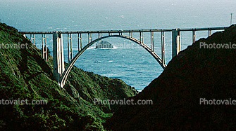
Bixby Creek Bridge in Big Sur, California, on Highway 1.
Hire a professional
You may be wondering why I just didn’t hire a talented graphic artist to create a logo for me. That is a good question. I have no problem hiring professionals especially when I know the limits of my talents. I hired an editor to edit my book. I hired a graphic artist to develop the book cover. I hired a website professional to take care of the backend and hosting service for my websites. In each of these instances, I had already done 80% to 90% of the development. I needed someone to help me push the project across the finish line.
Does your logo reflect you?
Just as the writing on my blog posts is a reflection of who I am, a sincere logo also has to represent me. The various aspects of my logo design represent something the captures a part of me – elements of design that I am drawn to. Even though certain design elements can be construed as some sort of metaphor about my business or services, I’m really not cleaver enough to incorporate such subliminal messages in a design.

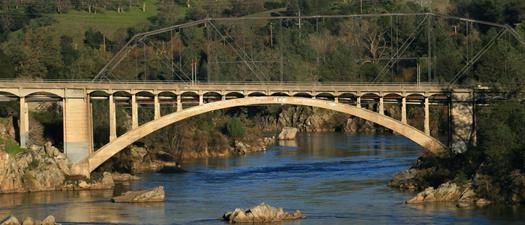
Rainbow Bridge in Folsom California over the American River flowing into Lake Natoma.
Basically, my logo is a stylized arched concrete bridge. Highway 1 on California’s coast is dotted with such arched bridges. They gracefully traverse over a creek or river that is flowing into the ocean. What I find interesting about some of these arched concrete bridge designs is that the apex can be thinner than curvilinear abutments. This has to do with how the arch or curve distributes the load of the bridge. The visual result, especially if it is a railroad bridge, is that the middle of the bridge seems to be floating, with very little support. The arch over the canyon or gorge is then framed on top by a beautiful and functional structure.
Anatomy of a logo
The arch of my logo is thinner on the top or apex than either side. The top of the arch intersects with a horizontal line that could represent the road way. I’m not sure why I chose purple for the color of the arch. It just seemed appropriate. On top of the road way is the vehicle or train; my name in block shapes. The Kevin Knauss name in reverse lettering is a holdover from my previous mid-century modern branding attempt.
Arch of triumph
Underneath the arch is my tag line – Education Before Enrollment. I believe consumers can only make informed decisions after they have the education they need to make a good choice. All this Obamacare health insurance is complicated and confusing. I’m trying to provide good information and education on my website so consumers can make a choice on health insurance that most benefits them and their families.
Dark blue water
The blue band underneath the arch represents water flowing under the bridge. I use this dark blue area to display my website address. The whole logo is framed in a black border. I’ve read that it usually isn’t good to frame a logo. It suggests being confined or constricted. I don’t see it as confining so much as defining. I don’t like the unknown. I need to know the limits, the rules, the boundaries. Every question must have an answer. My clients don’t like having unknown consequences when it comes to health insurance. They don’t want surprises and I have to agree with them.
Rainbow of support
Over several months in 2016 I had been looking a lot at my initial logo design, which was pretty much all black. It was more of a silhouette of a bridge, more representational. Then the mass shooting at the Pulse nightclub happened in Orlando, Florida. I was sick and depressed over the carnage and loss of innocent people. For the first time in my life, I went out and bought a rainbow flag and flew it in front of my house. My clients are a rainbow of personalities, ethnicities, orientation, cultures, ages, occupations, and locations.
It is the rainbow of my business that supports me, Kevin Knauss. That’s when I decided that the pillars supporting the roadway connected to the arch should be a rainbow of colors. Six pillars, one a different color of a rainbow. I created 90% of my logo with the improbably simple MSPaint program. I then handed it over to a graphic artist for the final rendering and conversion into images that can be printed.
Not an award winning logo
Are there too many colors and lines and spaces in my logo? Probably. But I don’t care because I like looking at it. Someone asked me if I chose my logo colors to connect with my target audience. I told them that the target audience was me. I have to look at my logo over 100 times a day on business cards, emails, social media, and on my website. I like looking at my logo. I think about driving the coast of California. I like the graceful arch. I think about trains and history. I like that it is colorful, sometimes like my language. It’s not a great logo, but I’m happy with it.