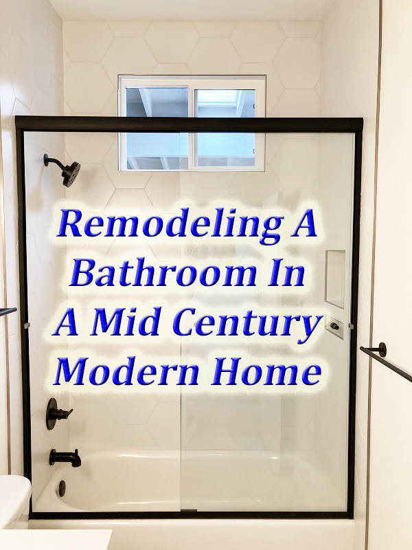
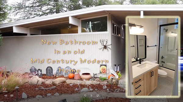
With our child out of college, it was time to direct the discretionary income at some necessary maintenance, upgrades, and remodeling of our 1968 mid-century modern home. After replacing the deck and air conditioning unit, the next item was the ‘70s vintage family bathroom.
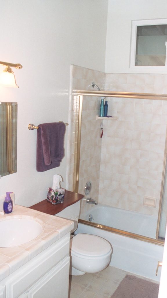
Bathrooms in old mid-century modern homes of our size – 4 bedrooms and 2 baths in 1,750 square feet, were neither big nor grand. The family bathroom was originally designed for small children: short vanity and low shower head over a tub. Adults are the primary users of the family bathroom, so we wanted to raise the aforementioned items.
The family bathroom is nothing special. The only mid-century modern features of note are a sloping tall ceiling, a large 4” x 12” beam running across the ceiling, and a wall hung toilet. The vanity was just a two-door and one drawer affair with a cracked tile on top. The tub was cast iron and the most difficult part of the demolition.
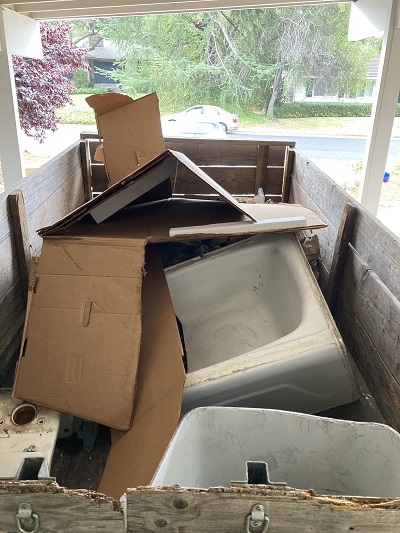
We probably spent more time considering the tub options than any other part of the bathroom. We decided to keep the tub-shower combination with sliding glass doors. One adult in the house loves her bath time and did not want to give that up. The suite bathroom, which is smaller than most of the closets, has only a shower enclosure.
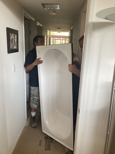
We went through all of the pros and cons of the different bathtub material – cast iron, steel, acrylic – and even toyed with keeping the heavy original cast iron tub. But it seemed slightly silly to keep the old tub when everything around it was to be torn out and replaced.
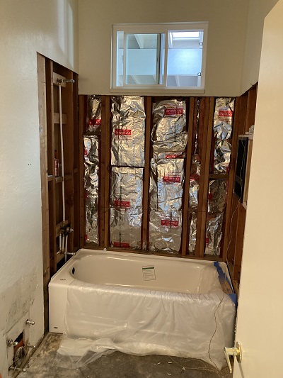
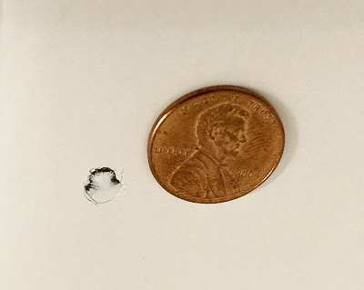
We settled on an enamel over steel tub for cost and appearance. The acrylic was a very close second option. To address some of the concerns raised about steel tubs, the Americast tub we selected is sturdy, quiet with the shower running, and keeps the water hot as a bathtub. I can confirm that the enamel chips. Somehow a tile fell on the tub and put a small chip in it. It was fixed, before we ever used it, and it looks just fine.
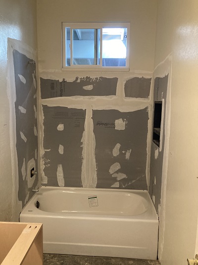
One change, which we would have noticed with either the steel or acrylic tub, and possibly a new cast iron design, is the floor of the tub is higher than the original cast iron tub. I notice that when I step into the tub, I step up at least 2 inches in height. I’ll get used to it, but it is a little awkward at first.
Next, what sort of shower door would work. We originally envisioned a frameless shower door; just two pieces of glass that glide on a single rail above. However, the frameless shower doors are really cool and also really expensive. It seemed overkill and out of place over a bathtub. We settled for a less expensive shower door, two sliding panels, that has a frame around all the sides. Except for having to raise your foot over the base frame, it works well and looks good.
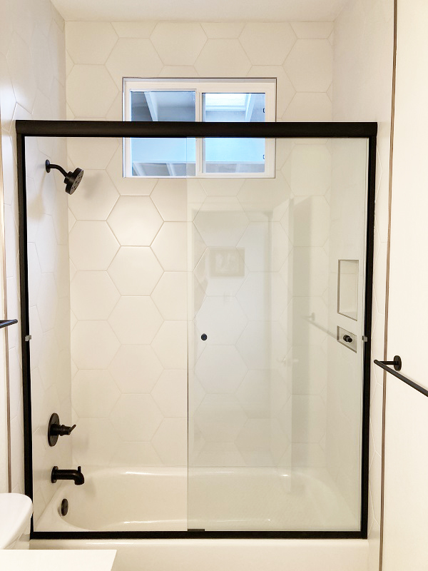
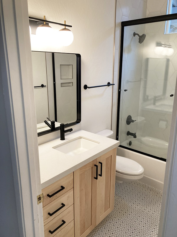
We decided to take the hexagonal tiles all the way to the ceiling, originally the tile stopped below the window. Taking the tile to the ceiling was a good decision. It really makes the bathroom look and feel bigger. Even though we were concerned that the shower frame would break up the illusion of height, it works from my perspective.
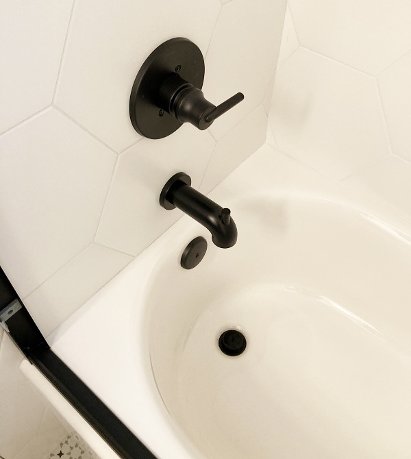
All of the fixtures are a black color and they are manufactured by Delta. To illustrate how small the bathroom is, we copied the original recessed toilet paper holder. Without the recessed fixture, maybe only 1.5 inches, it is easy to hit the toilet paper roll when lowering your body to sit on the toilet.
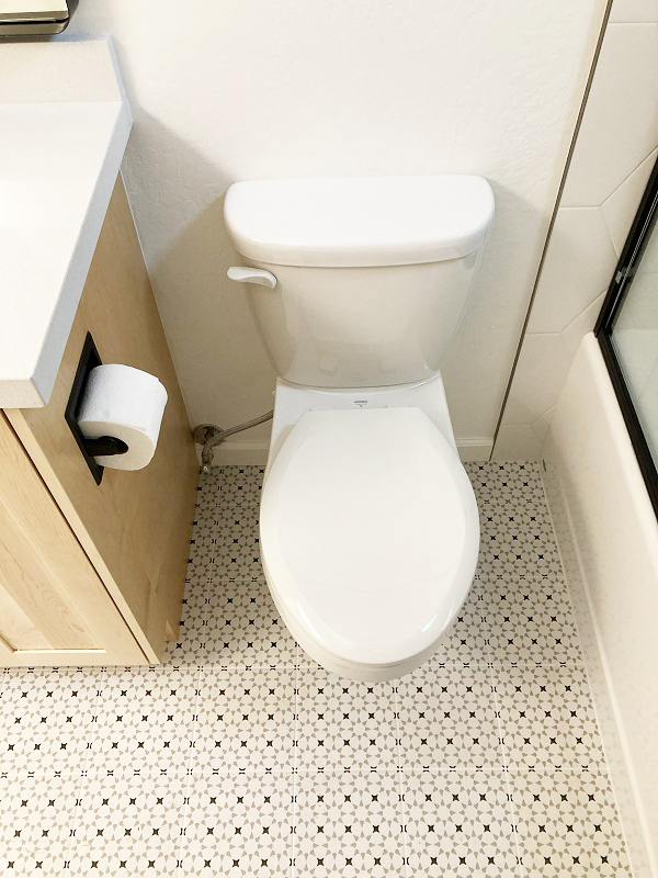
The toilet is wall hung. Don’t let any plumber fret over replacing a wall hung toilet, it is easy. We chose the Gerber because it extended 1.5 inches less than the competitor. In a small bathroom, an item sticking out just one or two inches can become a real issue. The Gerber low flow toilet has been working great. Our other wall hung toilet has a 5-gallon flush and STILL doesn’t push all the solids into the sewer.
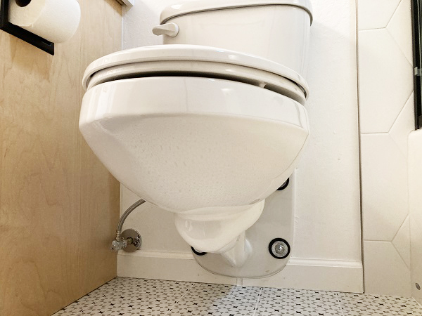
Gerber wall hung toilet. Installation was a breeze. 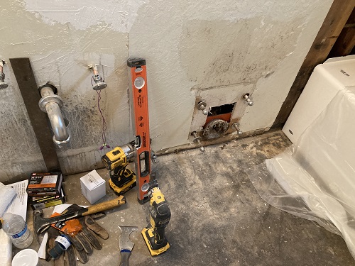
Wall hung bracket hanger and sewer inlet exposed. The walls are 2″ x 6″ studs to accommodate the weight.
The vanity counter top is a remnant we found at a counter top place. Finding a small piece saved us hundreds of dollars. The alternative is buying a full rectangle (something like 5’ x 8’) and having most of it go to waste. The white with some sort of grayish speckles in it works very well for the cost of $150.
While we like mid-century modern styles, we also enjoy natural woods. To soften the bathroom, we went with a maple veneer vanity. The four drawers, which are soft open and close, really expands the useable space. Before it as just a double door vanity with one drawer.
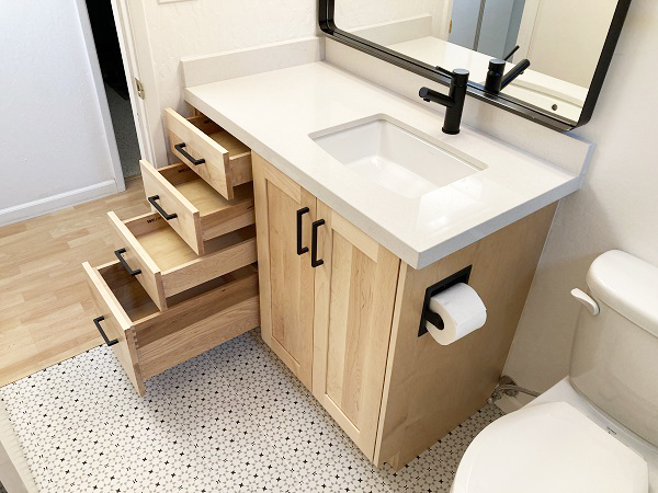
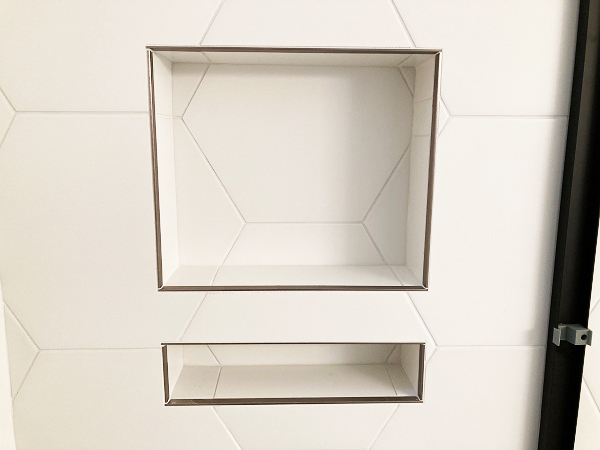
The floor is of square tiles with a nice geometric pattern that hides dirt. Linoleum was an option, but we decided to splurge on real tile. By far the biggest cost was the floor and shower tile. Two people, working 8 plus hours per day for 5 days to cut and place all of the tile. Of course, running the tile into the soap and shampoo cubby thing took extra time so all of the seams would line up. I was very impressed.
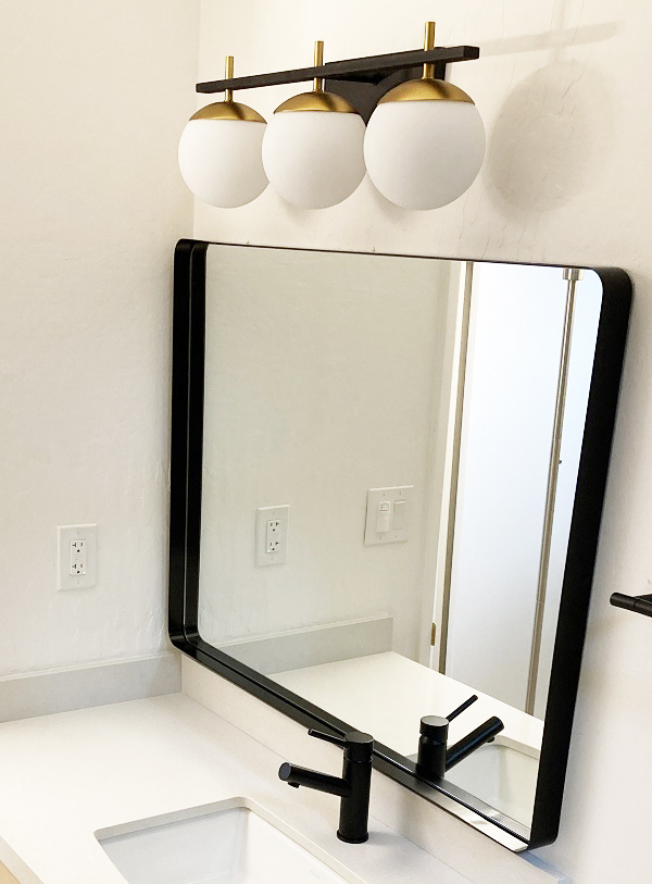
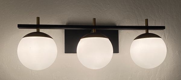
The light bar presents the least return for the investment. The black and brushed brass three ball light looks cool in the catalog, but is invisible when the lights are on. In other words, the light, which is nice and bright, turns the fixture into a shadow, you don’t see it. There are lots of light fixtures for half the cost, that would put out the same quality of light.
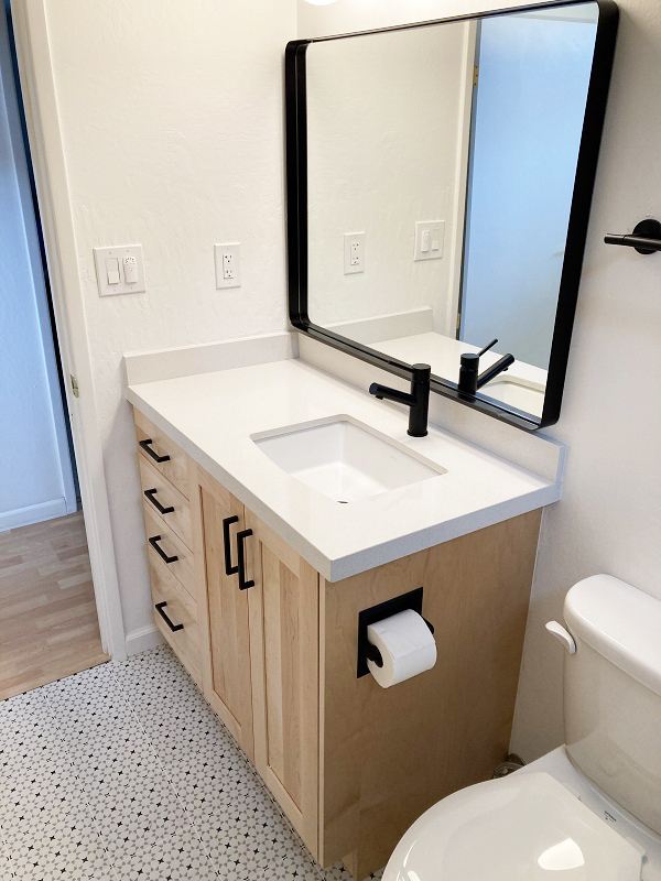
The mirror was questionable. We didn’t know if it should run the length of the vanity – it didn’t before – and if it should be framed or just frameless flat glass mirror. We went with this odd framed mirror that has some sort of shadow box on it. I like it. I think it works well with the dark shower door frame, towel racks, drawer pulls, and sink spigot. It echoes some of the rectangular elements of the shower cubby, shower door, and sink basin.
Overall, the bathroom remodel does not scream mid-century modern. It is more comfortably modern with some warmth from the natural wood vanity. I think it will age well. If we sell the house, there is a tub for children to have their bath time, so the family aspect of the room is not lost.
We hired a design-build firm for the remodeling project. Brenna Krouse selected materials based on our affinity for a little modern influence. Rusty Krouse was the project manager scheduling all the sub-contractors, demolition and building of the pieces. It took six weeks, just like they said, and it was on budget. The budget being approximately $26,000. In terms of money, I leaned more toward investing in items that will endure twenty plus years. Those items include the tile work, bathtub, vanity, counter top, and sink. Many of the other items are replaceable such as faucets, mirrors, light bar, shower heads, etc.
As we are not remodeling or plumbing experts, we did a lot of research, but also kept an open mind about alternatives. For example, we saved several hundred dollars by not going with the high-end frameless glass shower door. The vanity counter top could have more eye-catching splash, but the remnant we found works just fine.
We could have gone with a slightly larger bathtub, about 3 inches wider, but that would have entailed moving plumbing in the wall and floor drain. It didn’t seem worth the cost or possibility of unexpected surprises. Similarly, we could have converted the wall hung toilet to a floor mount. The additional expense, construction noise of chiseling out concrete, and extra time did not seem like a good trade-off. While there are limited styles of wall hung toilets, it’s a toilet and the wall hungs work just as well as floor mount.
What about the big 4” x 12” beam in the ceiling? Well, it certainly could be a design element. We have chosen not to highlight it in terms of painting it a different color or affixing lights to it. That is purely a design choice. From my perspective, the bathroom is already small, tinkering with the beam may make it feel more cramped. I’m sure someone could design a treatment for the beam that would really enhance a mid-century modern feel.
We are pleased with the final product. The functionality of the bathroom is slightly improved, but nothing dramatic. The big improvement is a vanity with more useable storage with the drawers. The tub has received high ratings from the primary tub soaker in the house. The toilet is comfortable and works well. The light is nice and bright, but not overwhelming. Overall, the bathroom remodeling investment will give us many years of happy returns.
