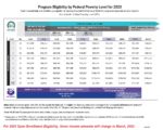
The income chart uses columns with specific percentages to display the annual income amounts necessary for different program eligibilities based on household size, rows. What can be confusing is that an income chart will be published where the math doesn’t work. For example, the federal poverty level (FPL) income for an individual is the 100% column. The next column is 138% FPL. On the 03/2022 income chart, the annual income amount in the 138% FPL column, $18,755, is higher than the 100% column of $12,880 x 1.38 = $17,774.


